In what ways does your media product use, develop or challenge forms and conventions of real media products?
For my A2 coursework I have made a short film which is in the genre of black humor. Black humor is making a grim or negative situation or issue a funny aspect or twist. My short film will follow the of concept thought out the film and have an unexpected ending but the main purpose will mainly be to entertain. The narrative follows a linear pattern but does have snap shots from the end at the beginning to pose questions about the film. My short film is about a man who cooks a meal for a girlfriend; however the audience is misled into thinking he is a murderer preparing her death. The target audience for this film would be mainly focused around a young, student audience who are more focused on the arts than anything else.


http://www.youtube.com/watch?v=P5_Msrdg3Hk
http://vimeo.com/19434214
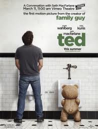
I looked at several film posters, however only a few caught my attention and highlighted key aspects which I could apply to my own print work. Firstly the “TED” poster offered a comical value of the poster which I thought could be an interesting idea to apply to my concept. Although I did not use a highly comical film poster design it still offered a useful insight in how to mislead an audience into thinking of my film as a horror. I also looked at “CLOE” which offered vital information into how to create an effective horror poster, with the close up of the actors head, accompanied with added affects to make it more interesting. The title of the poster also offers duel meanings often a more sinister meaning which is not normally spotted on the first viewing of the poster. Although there are often hidden clues in the title which suggest a darker meaning to the film. Often the horror poster will leave visual clues that reveal things about the film which you can only see with a second viewing, and although some audiences may see these clues they will often have no definite answer. I have drawn a lot of ideas from this poster especially the way it poses questions to the audience with its ambiguity. Another aspect of this poster which I found interesting and have used in my work, is the font, in “CLOE” the text drips like blood and this was a very nice effect with I immediately planned to use in my work and did use, in an effective way. Immediately it was a nice effect to my title and it was in a way more effective than the “CLOE” poster as I was able to incorporate it into my photography and combine the poster together, it also gave the correct look for horror that I wanted from my poster. I also looked at a few short films which I drew a lot of interesting ideas from, epically with camera shots and narrative ideas. With the black hole the camera shots proved very interesting, I used the idea of the close up shots to show a higher level of detail, especially effective in my film as it relied heavily on close up shots. This film was also a black comedy which helped me to see the basic idea of what made a black comedy into a black comedy. This is often using a violent or distressing situation and making it ironic for the comical value, which I have done in my film by quickly changing from the idea that the persona is a murder to a simple cook. Especially the main idea of a twist at the end of the film, which I have copied into my film. I also looked at a movie from YouTube made by someone in a similar position to me; this gave me an insight in to realistic camera shots and also a good idea of the location and props. For example the layout of the table with candles, this film gave me good information about how to go about making my film look and feel in the same way and also develop my own new ideas.
flat plan
review page flat plan
I have learned a lot about the codes and conventions from looking at real media example. Such as the film poster “TED” on looking at the layout of the poster you can the amount of white space, this implies a lighter side to the film and suggests a comical value, as well as using a bear and a man in a toilet situation as well. this code could use effectively in my film and although I did not use this effect it does allow an insight into what an audience views as a funny film, so that I could avoid it and put the correct message across.
The photography also highlights a comical value by having a long shot of the two actors doing something funny, this aspect was inspired into my film to have the two main actors; however I added a twist to mine and subverted the convention a little bit by adding a mystery with just a hand and a knife. On looking at the “CLOE” poster the graphic design played a massive role in helping me to understand what needed to be part of a film poster, epically logos and completion and awards which help attract an audience to a film epically a short film which is commonly seen by a smaller market. The style of the poster also follows the same conventions as a horror film and I have used these in my own work especially the text and photography used. The type of photography focuses on the main actor and the face that poses a lot of questions to the audience. This added sense of mystery would be a great aspect to my film and I used this close up shot which poses a large amount of questions, like why is she there or what has happened to her. Also looking at the other film example I could see their filming techquines. For example in the health and safety film all of the camera shots where close ups and focus in on small items at a time and this is a very effective camera shot, and I found this film very effective and useful in looking at the type of camera shots the followed the genre. This film also followed a slow edit pace which allowed for a buildup in tension which again I have used to the same effect in my short film, it is also clear to see a quite normal mise-en-scene throughout the film and I wanted to do this to mine as well to add a more causal feel to the film were something can disturb normality.
As well as this the film offered a dark visual feeling by having a low lighting throughout the film, further enhancing the feeling that something is not quite right as the film progresses. This is assisted by the acting which is also not quite right, by using slow and purposeful movements the actor helps to emphasize the feeling of uncertainty in the audience by combining all of these aspects together. By using suggestive framing and close up camera, these immediately mislead and confuse the audience,

such as the man putting up the shelf, we all see it as a normal job, and with the high level of safety we do not expect the man in the over room to be killed, as a result of close up camera shots on safety aspects of the film the audience has been misled effectively. The sound throughout the film is often non diegetic as it is background music which helps to add to the tension and buildup of the film, it also follows the dark lighting and acting to combine them all together. As well as this there is also diegetic sound of the drill, this is an interesting noise and with only close ups limiting the audience understanding the use of diegetic sound is very effective. Another media text which allowed a useful insight into the codes and conventions of review pages was the various review pages I looked at. The majority of review pages followed the same layout of an article and photos. I have also learned the codes and conventions of writing a film review from looking at these reviews. And although there are many different ways to write a film review I chose to have an educated and sophisticated tone to my article. This was because it attracted a more sophisticated audience which short films are especially aimed at and attracted by these types of people.

When making my film review page I looked at several key aspects to effectively create the desired effect. When I chose the colors of my review page I chose the main colors blue and yellow I chose these colors because they seemed interesting and would provide a massive interest, the colors also follow throughout the page and set the house color for the whole review page. I chose to have one large image of the main actress which I felt offered an insight into the film which would pose the most questions about the film; this would as a result attract people to the review page as this is the main attraction of the whole review page. I also accompanied the main image with smaller thumbnail which provided more snippets into the film, these make for a more interesting review page. I chose the shots of the knives because it showed the dangerous side of the movie, it also offered a more interesting look at my movie as these are the best parts of the film. The headline I chose for my review page was to draw attention to the review page, as most people skim through magazines and an interesting title would immediately attract the target audience into reading my article. By drawing the header and the images together it would immediately attract the target audience as this is the type of thing they are looking for. I also created the review in a sophisticated manner which my target audience would relate to; this would also create a good thought from the audience about my movie as they would understand the sophisticated language and be inspired to watch my film as a result of the review page, mainly the article which is directed at an intelligent audience who will be more mature and have a more common and idealistic view on society and therefore my review page is directed at a more grown up and mature audience. The fonts I used also helped to create the high level of attraction for my target audience; I used a sharp and stylish font which gave the review page a sophisticated and stylish look which follows the movie and house style, completing the review page and making it an immediate attraction to my target audience who are young and stylish themselves. I have designed a logo for my review page which shows a serious and sophisticated film magazine by using the film reel it suggests an older and more classical feel which makes the magazine highly sophisticated, by suggesting a more classical feel and audience, as well as this it also suggests that my target audience are much more sophisticated, however not nesercerily older but more aware of certain styles and different arts. I have done this to attract my target audience, who are young and follow Sirius Reviews of short films as they are in to arty culture like short films. I chose the film title the meal to create a sense of interest as the photography on the front does not correspond with food or cooking and it poses a lot of questions about the film and allows for the twist in the film to be twice as effective.

I have followed the codes and conventions of a review page, as I have used both images including a large dominate image as well as smaller thumbnail images. By having a header and a kicker I have followed all the codes and conventions. My kicker is designed to immediately entice my audience to the magazine, with it being a large piece of text it is normally the first or second thing the reader will see and it has to create interest in the audiences mind. I have done this by introducing the idea of the film without revealing too much to the audience. I have mainly done this as the short film market is quite small and my target audience will see a similar article which they will know is a short film review and they will be immediately drawn towards it.

On looking at my film poster I have also followed the majority of the codes and conventions, I have used a main image to dominate the poster, as well as awards for the films across the poster, this attracts the target audience who often watch film festivals and follow up and coming films and film makers. I have also subverted the codes of the black comedy genre by removing any suggestions of a twist in my film as the poster comes immediately across as purely horror, however although this may seem like the audience will get the wrong idea, however when designing the poster I used the title the meal to suggest that this is not a very Sirius film and further highlight the fact that the film is not a straight horror. I have done this to cover the black comedy genre of the film as this allows my audience to be completely confused when watching my film until the end where the twist will entirely shock the audience. The title also shows a quite simplistic side to the film and through this simplicity it can be seen that this is not a proper horror film and like the title the film will be more simplistic and not what the audience might expect. As well as this the food which can be seen on the actress is also clearly food and this adds to the comical value and is where all of the comedy comes from. As well as the food providing comical value we can also see that the actress is dressed up nicely for a normal date and a comical value comes from this aspect as what we expect has being completely subverted. Also on the poster is the dripping effect of the food of the knife, which looks just like blood, I have done this to create the idea that something wrong is going to happen in my film and misleads the audience to having pre ideas of what my film will be about. I have also oversaturated the color of my poster so that it is very yellow I have done this to create a sickly feeling and further enhance the sense of unease and mystery throughout the film.

When designing my short film I chose to have a clean, modern kitchen which would make the audience feel a sense of time period, which is based in the present, it is also a very normal everyday kitchen which further highlights the sense of normality and although we are lead to believe the protagonist is a killer it does pose questions whether this is true or not. I also designed the cleanliness of the kitchen to be perfect, such as the knives all laid out in perfect order, would immediately suggest a sense of perfection and possible a sense of an OCD from the main actor who Is present as being a bit odd by the cleanliness. I also kept the context of the kitchen so small by camera shots to try and keep everything pointing to the horror side of the film instead of suggesting the twist that occurs at the end of the film. When filming my film I used the codes and conventions of the horror genre to effectively create and mislead the audience into thinking my film is a horror when it is in fact a black comedy. I have done this by using close up camera shots, the close up shots followed the exact movements of the actor and these close ups pose questions to the audience what is going on, by looking at the knives and the drawing of the knife the audience will immediately assume something wrong is happening, accompanied with the close up framing the sounds I have extracted from the slamming of the knives and the knives being drawn, all of these actions are very slow and précis, and the audience know that nobody makes an meal this way so it creates a point of interested as to why he is being like this and possibly enhancing the idea that he is a deranged killer.

I have also enhanced these sounds to make them much louder and more interesting, I have also added loud noises on top of this where I have added reverb and effects which create a strange and unnatural noise which put the audience at unease immediately. I have used a relatively slow edit pace which only speeds up with the slightly more intense scenes like the knife being slammed or the tap being turned on, as the sound effect accompanied with this is extremely unnerving so by accompanying it with a faster edit pace it builds up the tension and suspense amounts the audience. I have also used a backing music to accompany the film, this music is quite tense and helps dramatically upgrade the tension of the film, the music also steady builds up and also gets louder as the film progresses, I have done this to make the twist at the end even more of a shock, and to increase the enjoyment of the film. I have used continuity editing so that we see everything action in correct order and the shots are a continuous sequence this again demonstrates to the audience that we are being forced to see the laborious, strict , controlled preparation of the meal as a result of this it is clear to see how the tense build up effects the film with the continuity editing. When designing the table and the costume of the actress I chose a white dress as well as a white table cloth, this was to create a sense of purity and to emphasis the mess created at the end. I have messed around with the narrative slightly which subverts the codes and conventions of short films, as I have a small flash of the end of the film, this only lasts a second and makes the audience wonder what is going on, this further emphasizes the tension throughout the film till the end. I have generally followed the conventions; however it could be said about the film that it subverts them as I follow the conventions of the horror genre instead of comedy, however this was only done to mislead the audience to allow for the twist to be more effective.
I have represent my main actor as a young male however it is hard to relate to him as you do not see him entirely, as a result he is shrouded in mystery, as we never see his face it effects the way the audience relate to him, which will be in a negative way as they cannot fully sere or understand him. However the actress used in my film is young and attractive and my target audience who is arty and interested in short films, however they will also be interested in going out with their friends, as a result they will be attracted to young women which will draw here interest in. looking at theories from the Ingham who states that the majority of women are represented in the kitchen, however my film subverts this theory as I clearly have a male in the kitchen and although it is not until the end of the film we realize that he was cooking it is clear to see that it is odd to see a man in that atmosphere and environment. Another theorist is Barthes whose narrative theory suggests an enigma. I know that my film others an enigma to the audience as it subverts the audience by pressing for the horror genre rather than the comedy, the creation of very precise movements and actions poses questions about why he is doing this, suggesting a killer, when in reality he is just making a meal. At the beginning of my film I have a little flash of a girl covered in food, however as a result of the speed, and the color saturation tinted red it immediately looks like she is in pain and from a horror film. This flash is placed in the middle of a slow and sinister turning on of a light switch. Together they combine to creating a sense of unease from the outset of the film. By using Bathes theory of narrative I have being able to create a sense of mystery and an enigma which has effetely created the twist in my film.
2. How effective is the combination of your main product and ancillary texts?
The style of my video is directly reflected onto the poster and review page. As I have made a black comedy following the rules of the horror genre the film is quite dark and poses a lot of questions, with odd camera shots and also closes ups to mask what is going on in the wider world. I have tried to reflect this into the poster. I have done this by dragging out the food into the actress’s hair, this also bleeds from the title into her hair, this dark image suggests a horror genre and attracts the audience to come and see the movie. However on looking at the title of the film the meal it would suggest something other than horror and possible a joke, this again would attract my target audience who are interested in arty short films. The poster also express the same idea as the video and it is clear to see that they both complement each other by following the same codes and conventions to effectively attract the target audience by appealing to their interests, mainly poster have awards on it as well as interesting effects like the blood being drawn into her hair as well as the blood of the knife. Another interesting effect which attracts the target audience is the look on the actors face which poses a lot of questions about what has happened to her. The synergy of my work helps to link them together as the audience can see the poster and see the blood and the interesting camera shots and then recognize them in my film or review page. For example the color red is mainly spread across all my work which is the main color, and my audience will recognize it spread across the print work and the film. Although with the poster I have chosen to use the girl as the main aspect of the poster, however we only see her at the end of the film. As a result it would properly have been a better choice to use a different photo of the male character to create more effective synergy across the pieces of work. However it is clear to see that the when watching the film the audience will be in anticipation as to when the story of the poster folds into the film, helping to build tension as it is watched.

 This is very important in attracted the target audience by recognizing any aspect of my work. As well as recognizing the colors, the genre I have presented will also attract fans of other genres as they will be able to recognize the horror genre and possible the black comedy genre I have hinted at. Although it is clear to see that there is very little synergy between my film as poster, as the film does not follow as strong horror conventions as the poster does through effects like the change in saturation. As well as posters and review pages there are many other forms of synergy such as TV ads and internet advertising that would be direct at my target audience on channels and websites they would watch and visit, as well as this the film can be advertised at film festivals and other competitions.
3. What have you learnt from your audience feedback?
What is your favourite genre of short film?
How old are you?
15-17 71.43% (5 votes)
18-20 28.57% (2 votes)
20-24 0% (0 votes)
Favourite type of genre?
Horror 23.08% (3 votes)
Black comedy 53.85% (7 votes)
Action 23% (3 votes)
My target audience will fall into the ages 18 to 28 and will be both a mix of male and female. My target audience will have a massive interest in the arts especially in short films and abstract art, as well as this the majority of them will be in further education weather at A level or university, although some will be slightly older and hold jobs as small time directors or artists, following on from there arty background. The majority of my target audience will have a large interest in making their own short films and over arts. They will also probably be quite interested in attending concerts such as reading. The target audience will have a very indie fashion sense and choose alternate clothing to link to there more expressly personality’s. As well as this it is also clear to see that they will shop at more alternative shops which offer there more alternative style. However despite their alternate styles, technology is still used by them just like everybody else, to contact their friends via social networking sites such as Twitter and Facebook, they will also access apps which will give them access to art studios and new short films, like the BBC short website. My target audience may also watch film channels on television that sometimes broadcast short films; however they will probably watch more arty channels which would directly appeal to them, often on all day as students have a lot more time on their hands. They will also have a massive social life as they will go to concerts, festivals with their friends from the same background. My short film immediately attracts two audiences, firstly it attracts the correct target audience who are an artier indie audience who will be interested in a black comedy short film as it will pose questions and provide enjoyment and entertainment.my short film does this by using a set style of camera work which shows an interesting aspect and angle which will create interest as the target audience will see this and be immediately attracted to the film and the interesting angles it poses to the audience. However the film also could mislead the audience and attract the wrong target audience, from the horror genre. As the film uses heart beats which are a common effect used in horror films and as they are used at the beginning of the film, they might put of the intended target audience who will recognize it as a horror and turn it off. However over all the majority of the film address the correct target audience, and uses more arty techniques which will attract the target audience I intended to attract.
Do you use your smart phone technology?
Yes 100% (10 votes)
No 0% (0 votes)
On looking at the pre-production questionnaire it is clear to see that my target audience where kept up-to-date with the latest technology including a smart phone. In my film as a result of this I used a smart phone as part of the narrative to further entice my target audience. My target audience also expected a black comedy film. I feel that I have achieved this expectation, on looking at the post production survey the majority of my target audience understood the genre and immediately recognized it. However the results would also suggest that the target audience recognized the horror genre throughout my film. Although I was aiming for this, the target audience may have been disappointed as it was not a real horror, for an improvement I could have made the genre more obvious. Another positive outcome is a result of both surveys shows that the target audience uses the internet to watch short films and as a result my film was placed on YouTube where they are more likely to view the film. On looking at the post production survey it is clear to see that a large majority would watch it again, by using YouTube I can spread the film out further. This also shows how by using market and target research I know where to put my film so that it gets the best publicity from the target audience. Furthermore another problem which the post production survey showed was that there was a misunderstanding of the poster as to what genre it actually was.
could you tell the genre from my review page
The majority recognized it as horror so I could have improved this by making the genre much more clearly possible by suggesting a black comedy with a more comical poster. On looking at the feedback it is clear to see there were a few key improvements I could have made. The narrative could have been made more interesting by having a better location and micse en scene, for example more blood and less light which would have cast more shadows which would have heightened the audience sense of mystery. I could have also added fake blood to the walls to feel the killer idea more effectively. I could also have used more effects such as red filter or earthquake to create more unease. Another aspect was the outside scene which should have been done indoors to keep it enclosed, as well as this the costume of my actress should have been more formal and posh, as well as the table which should have been laid out in the dame manor. The more positive aspects of the film from the audience feedback where the camera shot and angles that were outstanding and really followed the style of close up and restricting view which helped with the genre. They also found the poster and review page helped to feel and accompany the film and did it justice. Especially when looking at the film from a media prospect it is clear to see an it has a very strong narrative which the feedback showed, as all enjoyed it and understood the black comedy genre.
4. How did you use media technologies in the construction and research, planning and evaluation stages?


Throughout my A2 media course I have learned a lot about the use and application of different software’s to aid me in my work. To help with this new soft wears are becoming more accessible to the budget film maker as well as this the latest HD cameras which offer better quality film, are also becoming cheaper and more accessible. As well as this the modern society are all becoming pro-sumers which his incurring a lot more creativity and with the easier accesses everyone can use the best technology to create budget films with all the new young creators and the best software gives advice and how to use the best effects which are been used by the most budget creators. I have used Photoshop to design my double page spread and film poster, I have used the smudge tool in my poster to drag out the blood across the page and blend it from the title into the actors hair, this created a very effective look and I did not know about this tool before so it has being a massive asset in creating my film poster. Also when I made my film poster I removed the arm of one of the actors to add a further sense of mystery and I did this by fading out the arm into white, this tool was very easy to use and was a great addition to the film poster. Post production helped me correct any mistakes I had made during filming or taking my photos, when looking at the film I could edit out mistakes made in filming such as unwanted sound or unwanted images seen in the shot, which could be easy edited out. By using a quick edit pass and use effects which can only be added using post production material like final cut. Some of the effects I used such as adding a red filter helped to portray the horror genre and then attract the correct target audience who will see the effects which ricochet throughout films that follow the same conventions within the genre and I have done the same to create a sense of horror as the film progresses. I also used InDesign a system used for publishing documents, which can be edited rapidly, by changing the alignment to write my article this was a great tool to use as it helped me to write it with ease and also placing it on the review page. I have also used new software called final cut, this was used to edit and create my movie, during this process I added several visual effects to the video such as added shake to the shot to create a sense of unease, and it was a very good effect for my film and treated it well. I learned all aspects of final cut when I started editing and it was very easy to understand and I had no hindrances from it in any way. I was also able to add sounds effects using final cut which was a massive help as it could all be done on the same software, I added reverb to the sounds and it was a good effect to the film. When using in design a flaw I found was I could not edit anything except the text which proved a small hindrance when I wanted to make small adjustments I had to go back to Photoshop. Also I had access to HD cameras which greatly increase the quality of the film.
I have used word press just like AS to organize my work effectively and It was a great asset to have because I could easily find my work to look back over and it was extremely helpful to have my work all in one place, especially as It is online I can access it anywhere. It was also a massive help being able to base my polls form word press which gave me a lot of valuable information on my target audience. I used the internet messily in researching by using it to assess short film websites like bbc short films, and YouTube which offered a lot of usefully short films to analysis, I did not really use TV to do any research, but this is only because short films are not really shown on that market and are more common on the internet. Overall I think I could have made more effective polls to find out more relevant information about my genre and the target audiences interests. However it was not a major setback but I feel I could have used the internet and poll daddy systems to find out more information. With newer technologies coming it is getting easier and easier to assess the internet across the world at any opportunity, as a result of this people can access YouTube and over websites with complete ease, and therefore it would be a great idea to advertise on apple stores and websites which that target audience are visiting such as social networking sites such as Face book and Twitter where a large increase in popularity and although this is not vital to selling the film it has a massive increase in who sees the film and the quicker it spreads to people it also helps to get the film to people who would not necessarily be looking for short films.
With the ease access becoming easier and easier it is important to reach the target audience at all avenues of their life as they are visiting more websites than ever, it is great to advertise to them im more and more places to help sell your product.


